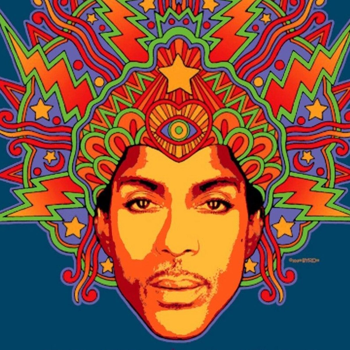
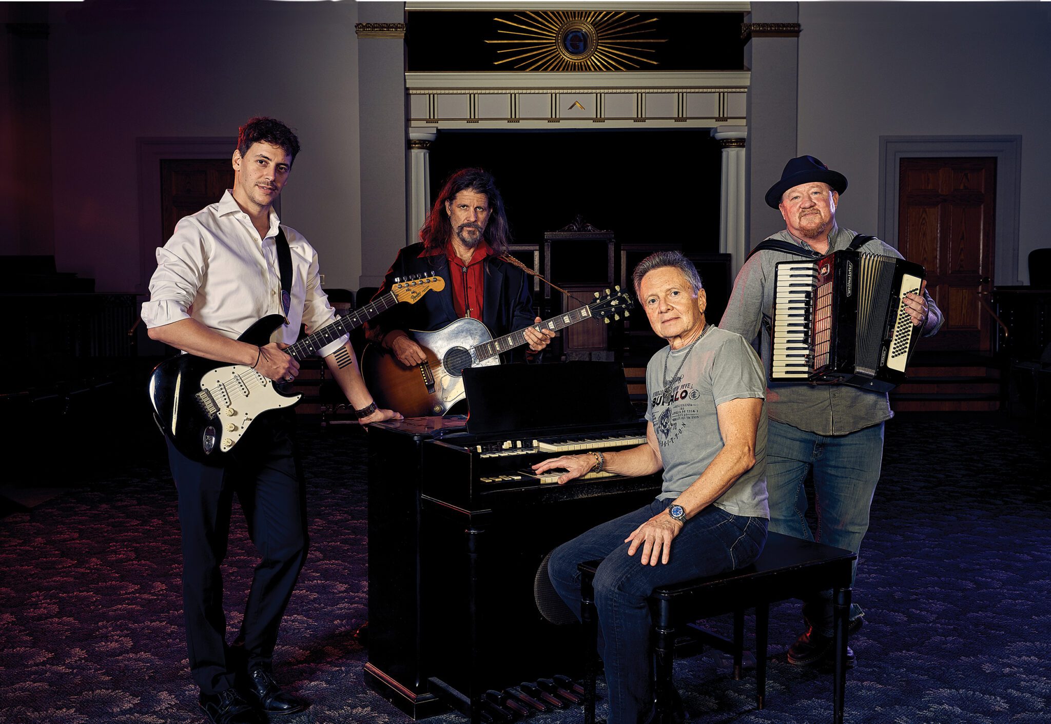
Rave Recollections of a Mason and Concert Promoter
A concert promoter, musical impressario, and California Freemason reflects on a very full life in concerts and shows.
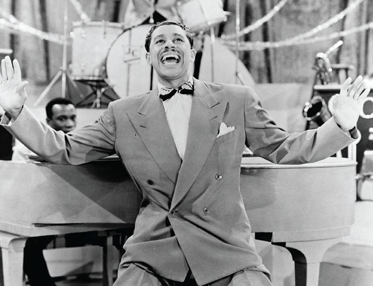

A concert promoter, musical impressario, and California Freemason reflects on a very full life in concerts and shows.
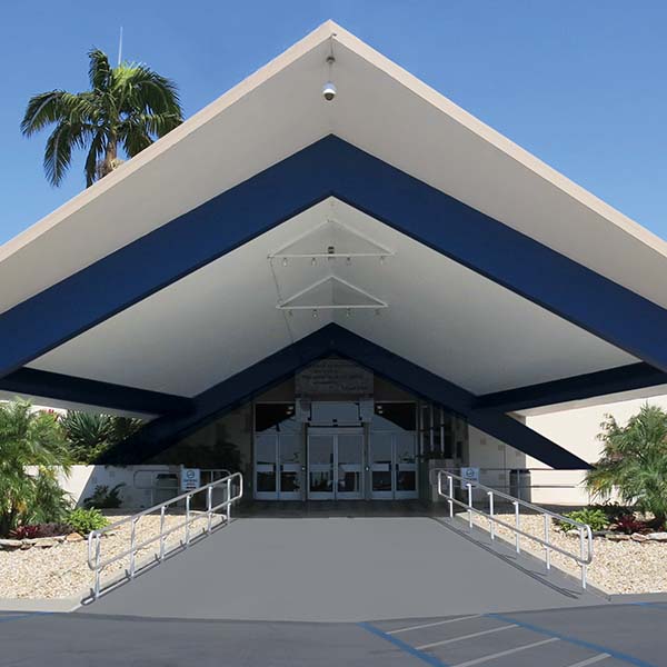
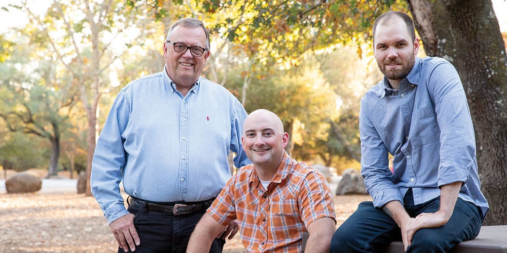
Celebrating one of the state’s most architecturally distinctive Masonic temples.