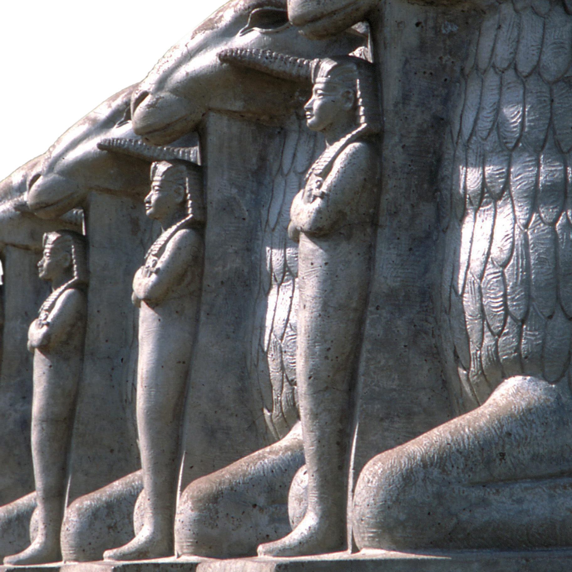
The Sphinx’s Lodge
The Rosicrucian Egyptian Museum in San Jose is a testament to a curious fraternal relative of Freemasonry.
The Rosicrucian Egyptian Museum in San Jose is a testament to a curious fraternal relative of Freemasonry.
In Sonora, a historic lodge gets a facelift—and a new call group to call it home.
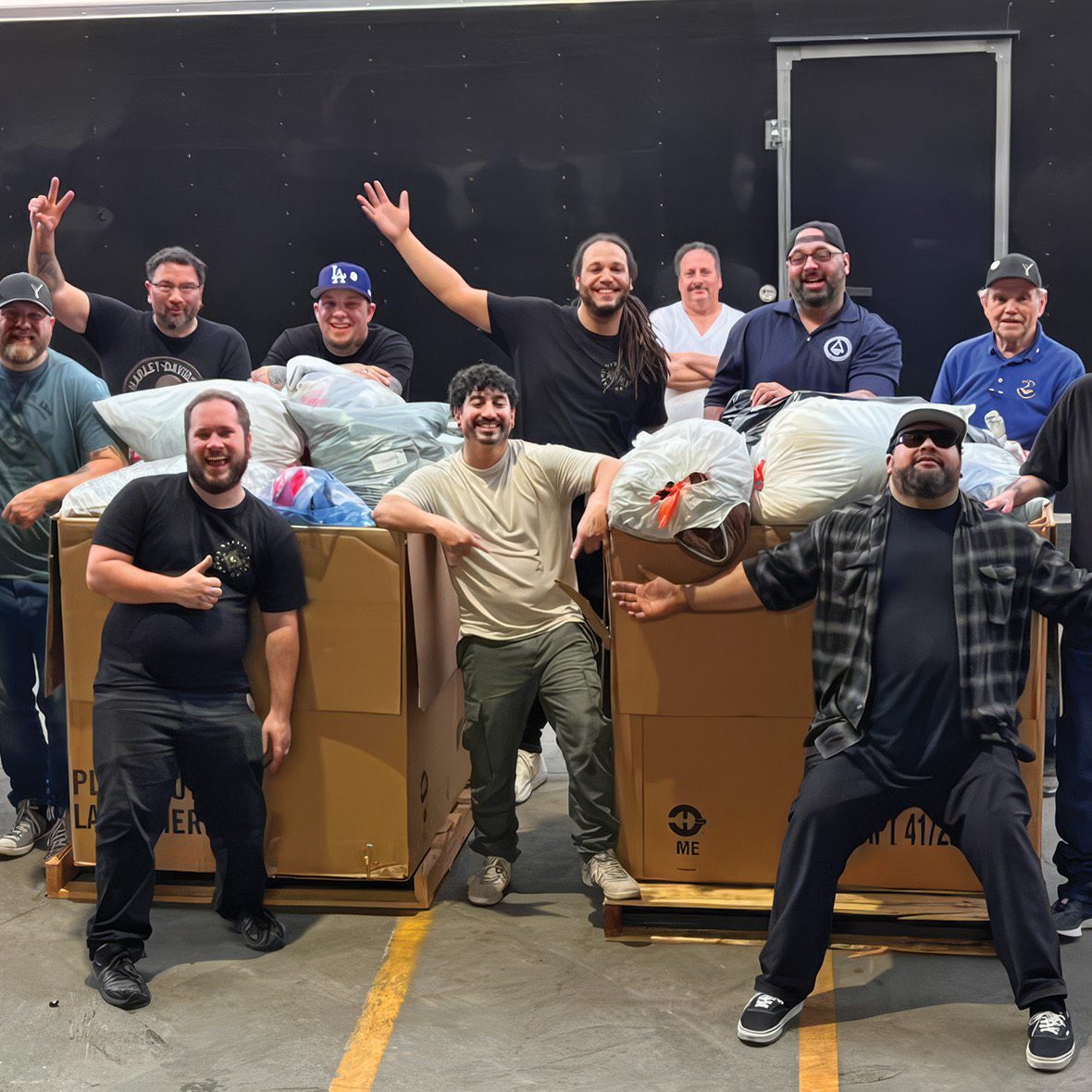
As the Los Angeles fires upended countless lives, California Masons rallied into action.