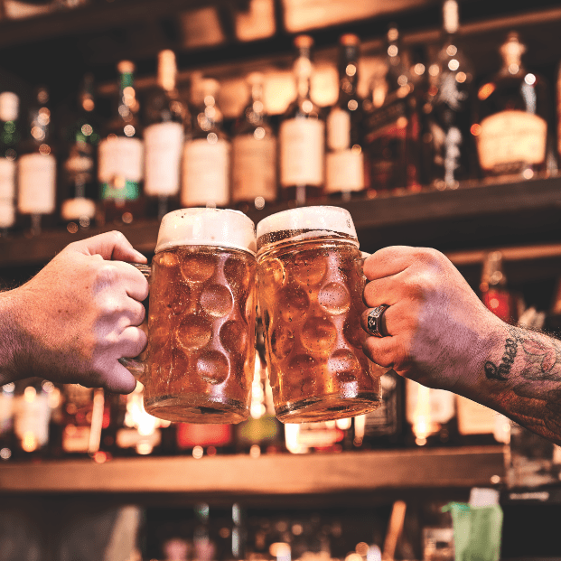
Cover Story: At Refreshment
Why lifting a drink represents the pure, distilled essence of Freemasonry.

Why lifting a drink represents the pure, distilled essence of Freemasonry.
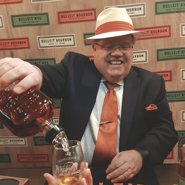
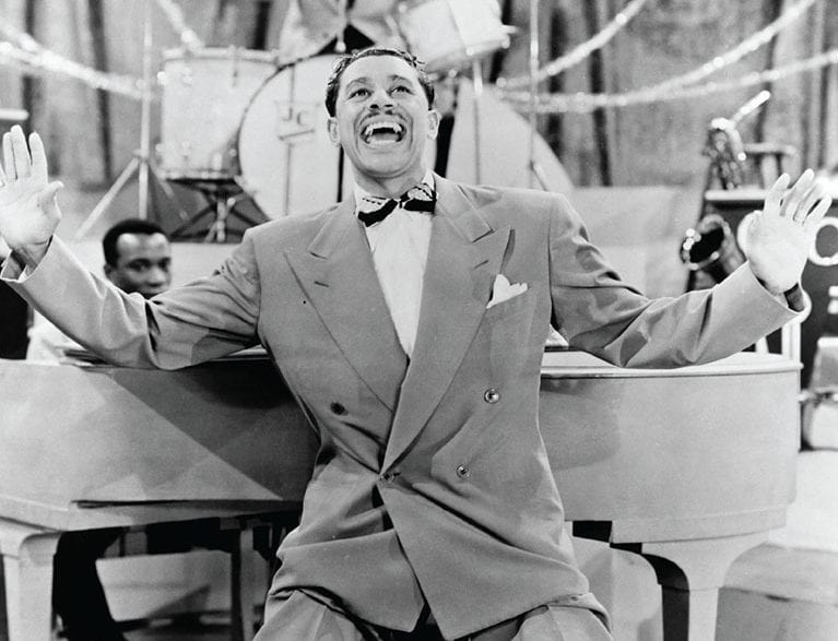
Whiskey expert and priest Steve Beal on communing with the divine.
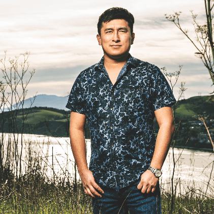
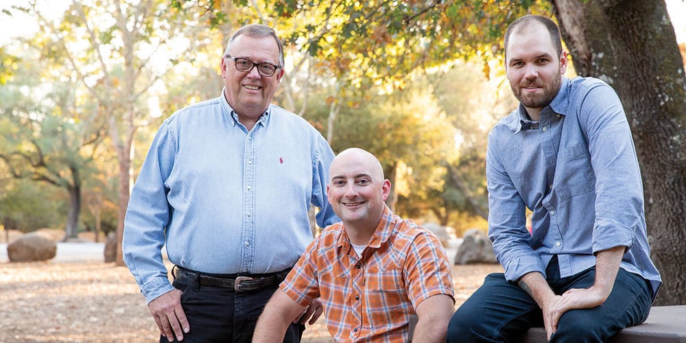
A 20-something on Masonry in California compared to his native Peru.